flormie: Turn flower discoveries into a personal collection
I leveraged AI to design, build, test, and launch a consumer-facing iOS app from idea to App Store.
My Role
Product Builder
Platform
Consumer iOS app
Status
Launched on App Store
Tools
Claude Code, Codex, Xcode, Figma, Vercel
Background
As a UX designer without a CS background, I used this project to explore how far I could go with AI.
Initially, I was experimenting with various AI tools, trying to build small projects as fast as I could. But then I started thinking about how I could scale a project with AI. And yes, I did turned this small project into a live product on the App Store at the end of this project. (yah!)
App overview
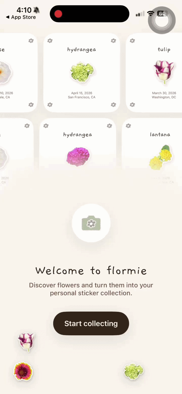
flormie helps users identify flowers they encounter and allows them to collect and engage with their discoveries in a personal and interactive way.
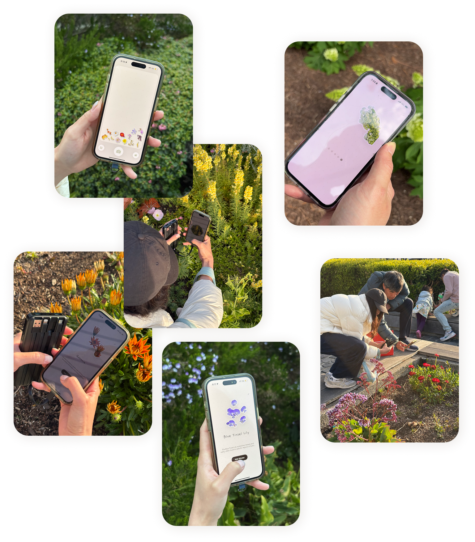
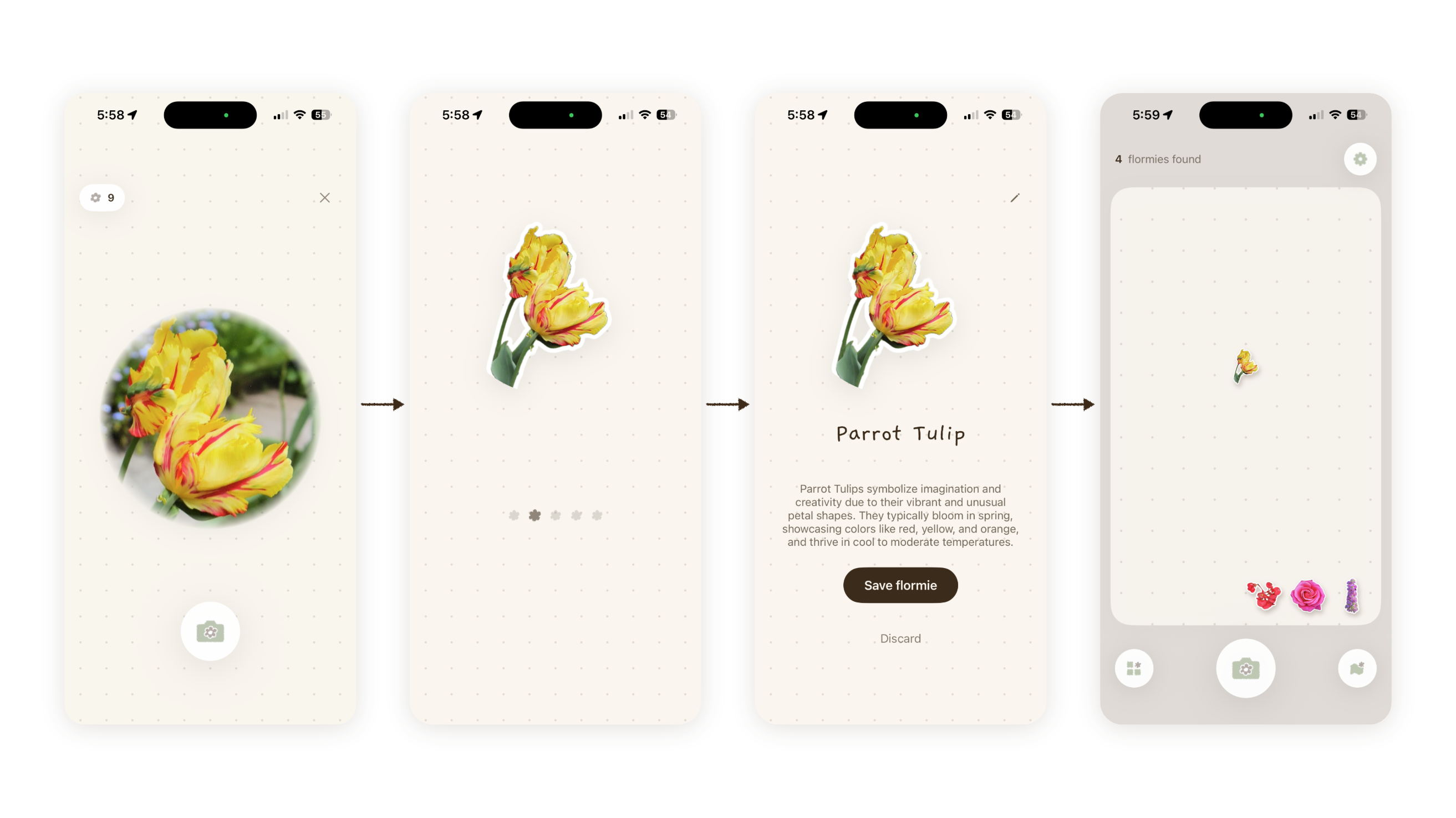
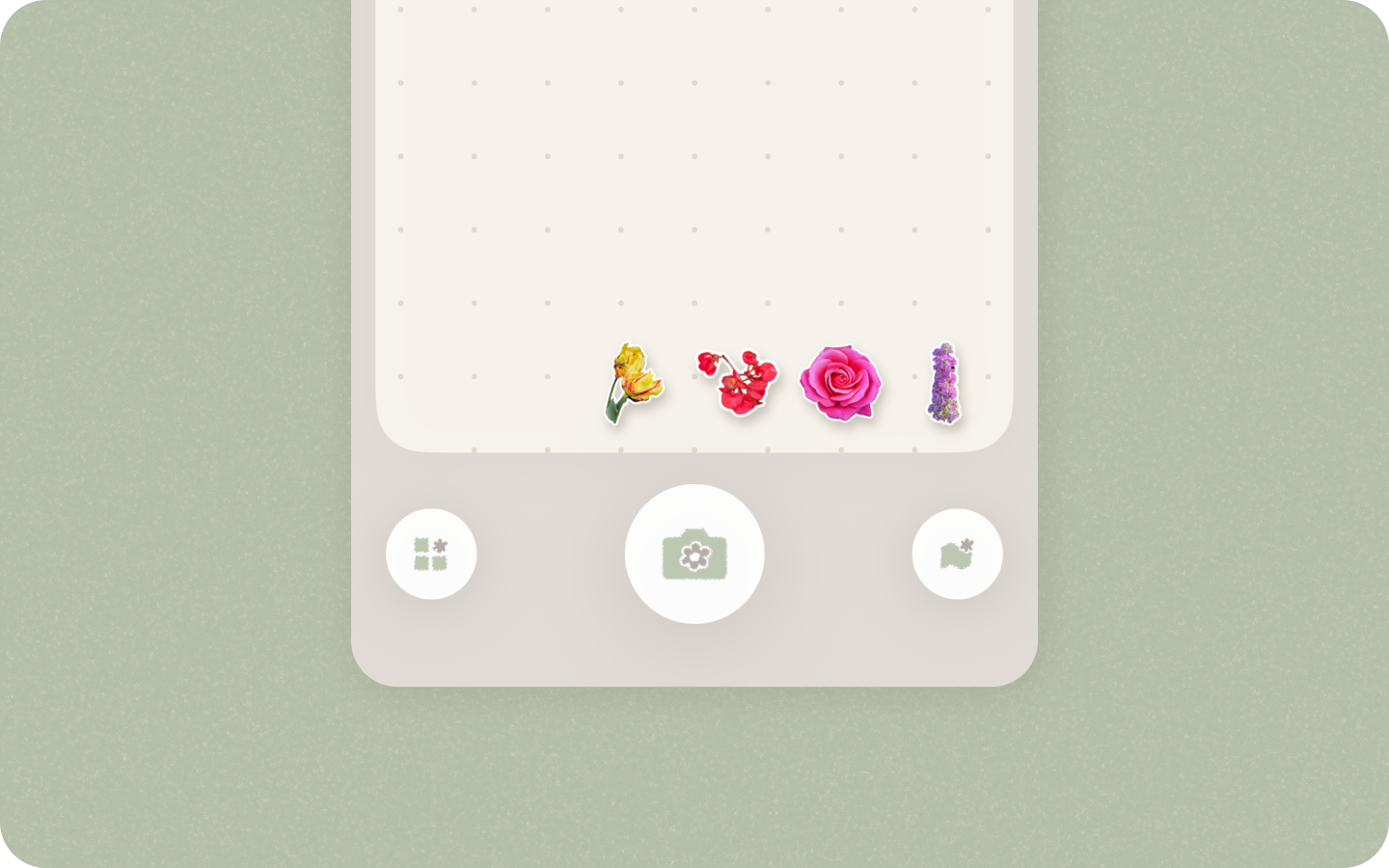
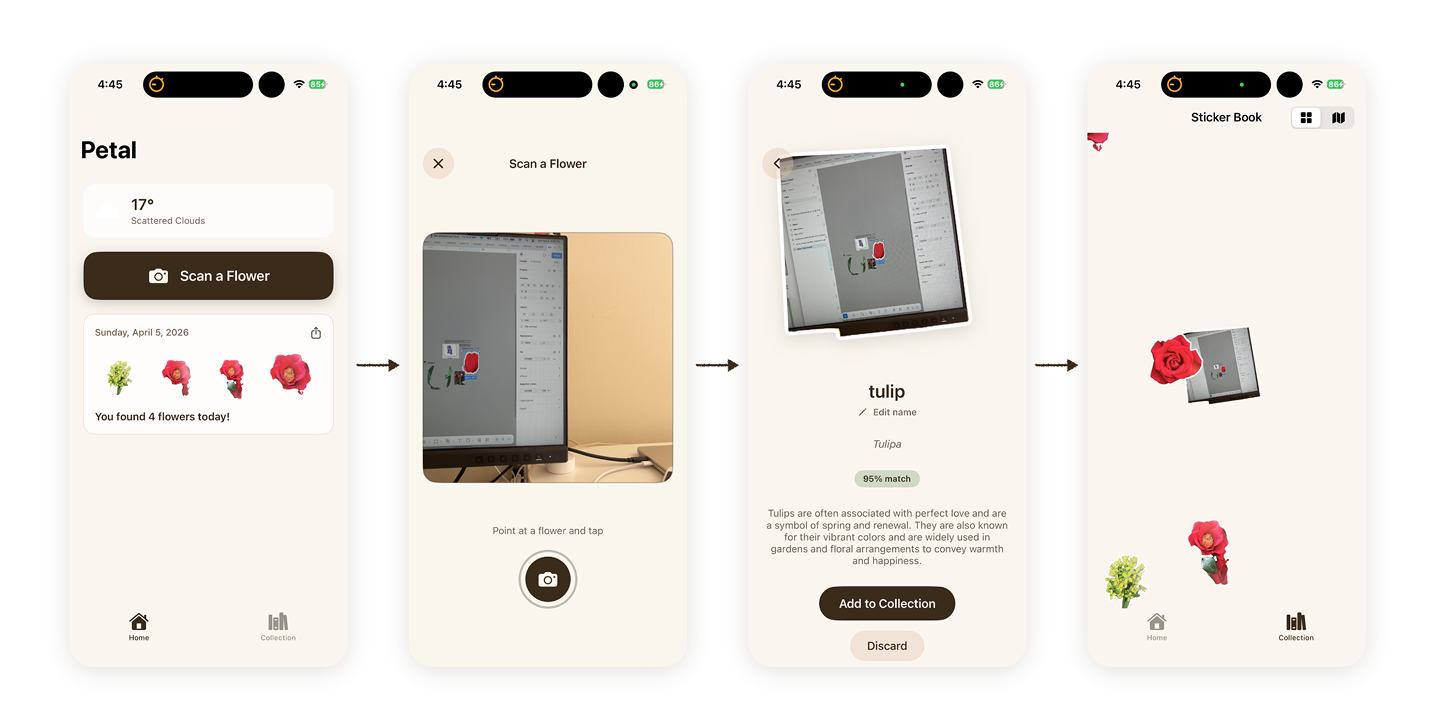
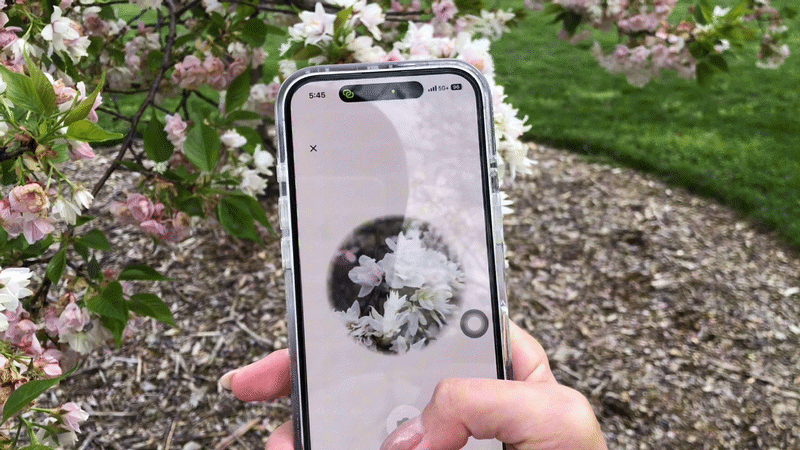
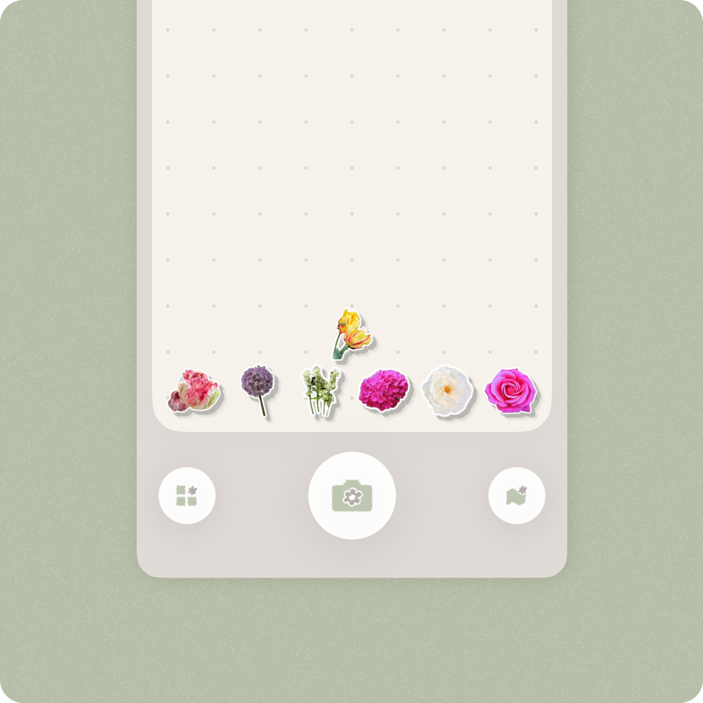
Collect a flower
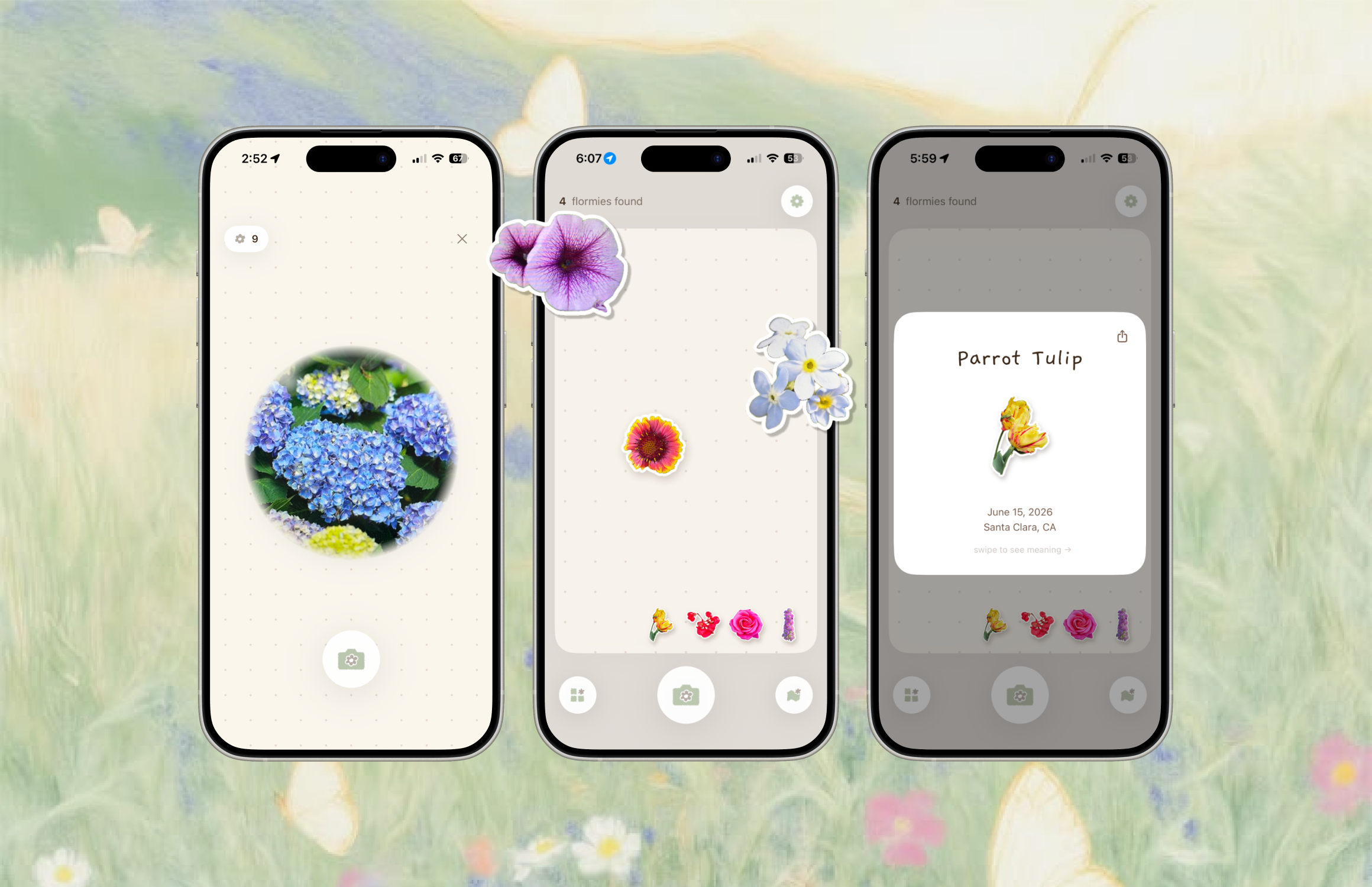
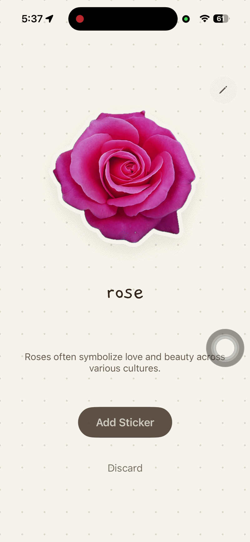
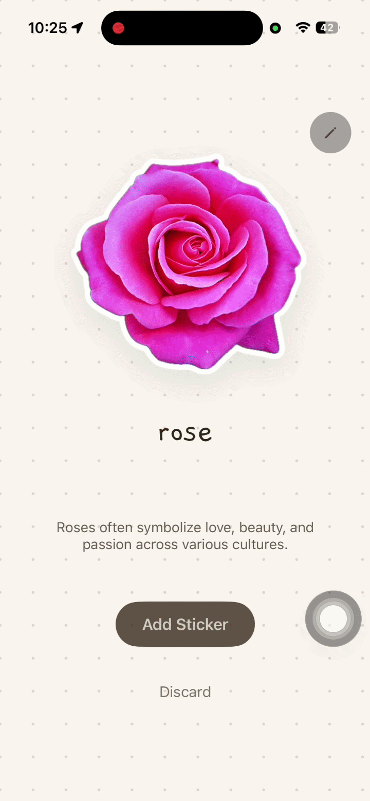
Core user flow include snap a picture, identify, and shrinking into floating stickers (or flormie) on the canvas.
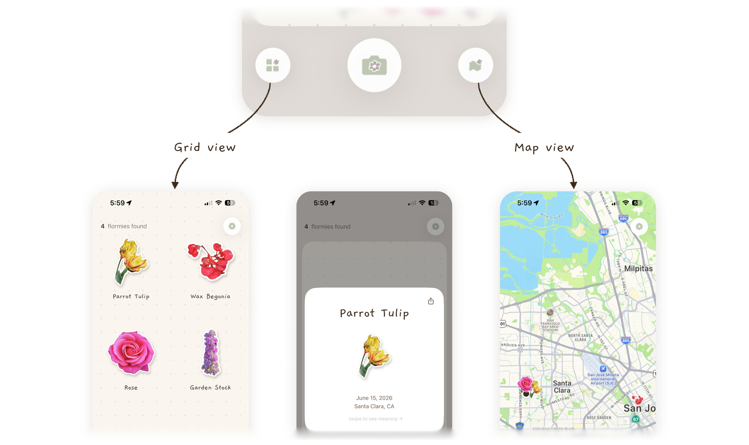
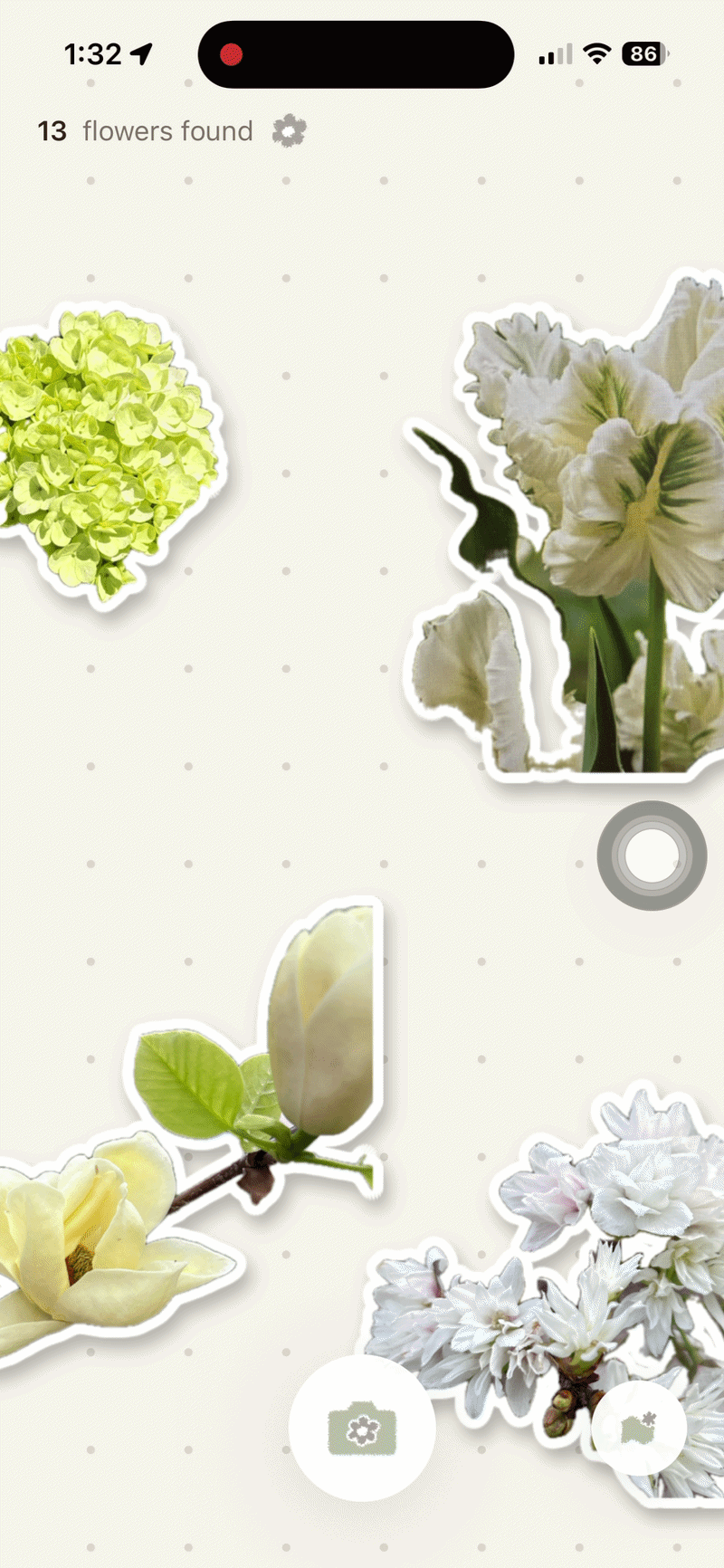
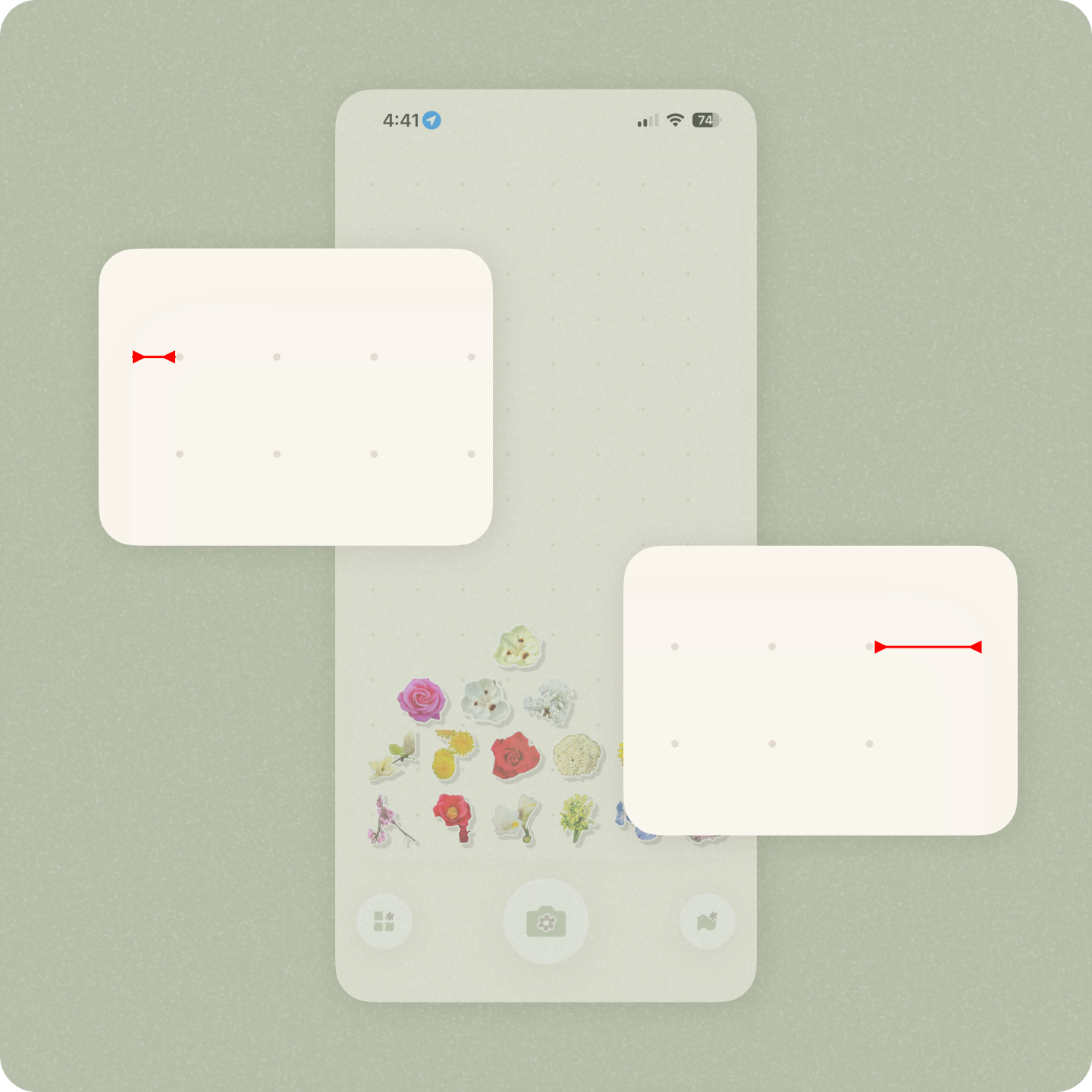
Different views
Beyond that, there are additional views for the collection. On the left, a grid view displays stickers and names for easy browsing. On the right, a map view shows where each flower was discovered, helping users revisit their memories.
Why I made this app
The project started from my own pain point, then grew into a bigger user needs from my observation.
I kept seeing and identifying flowers, but I could never really keep them.
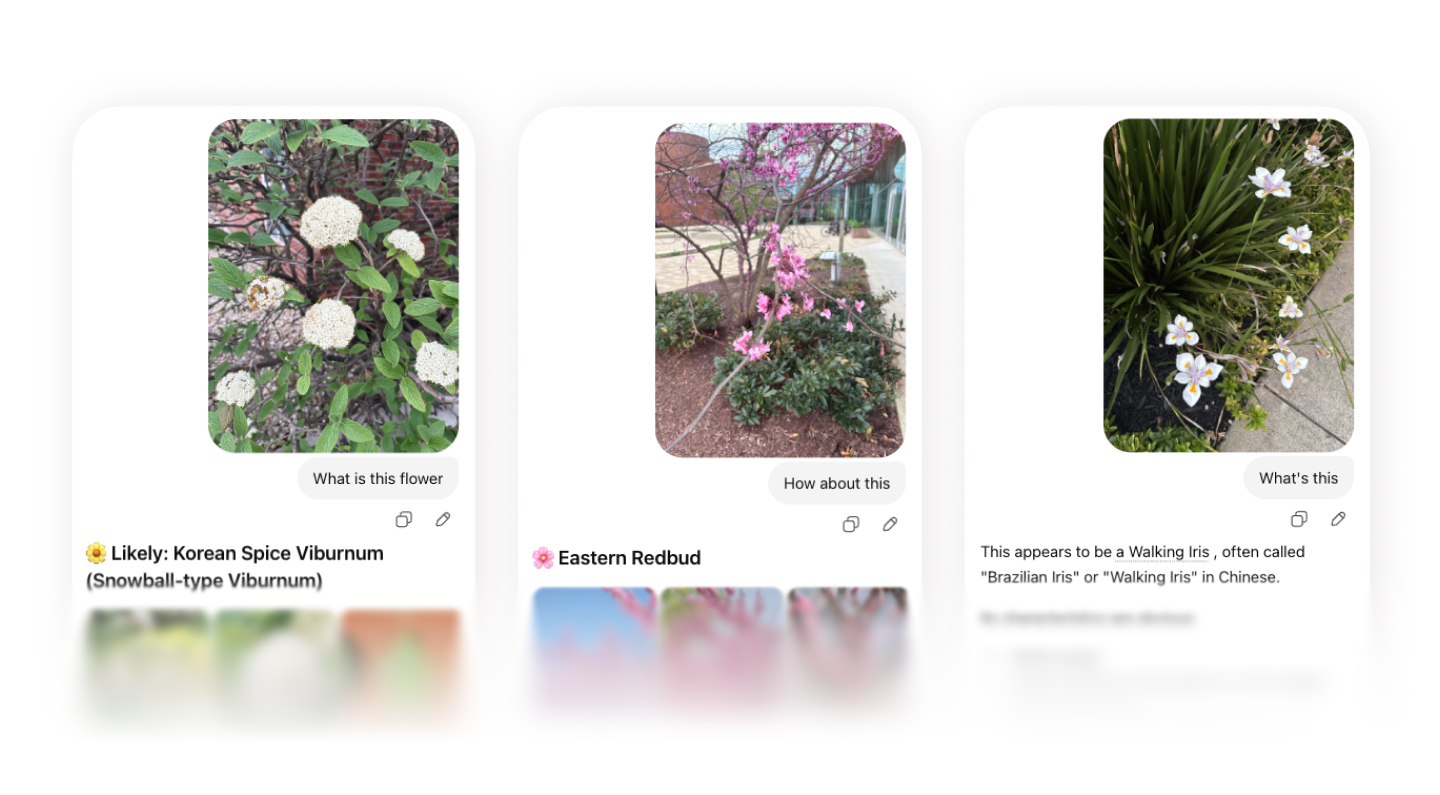
In Spring 2026, I kept seeing flowers on my walks. They were so pretty, and I wanted to know who they were. Every time, I would open Gemini, snap a picture, prompt “What is this flower,” and get the answer.
Over time, I noticed I could not remember any of them. I had too many AI-generated threads and too many flower photos scattered in my album.
Beyond myself, I noticed more people trying to identify flowers.
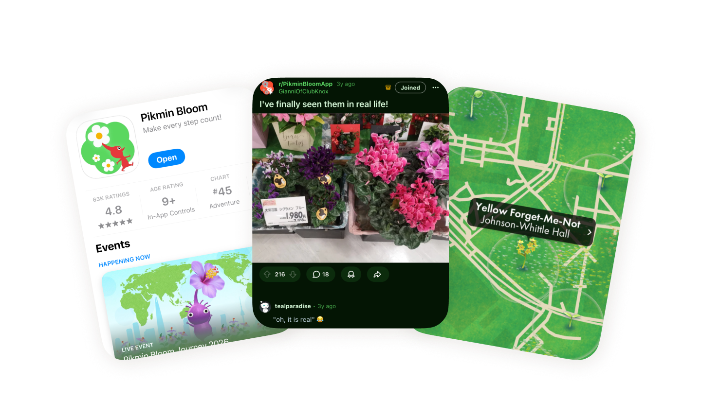
Pikmin Bloom by Nintendo motivated more people to identify flowers on their walks. People posted on Reddit, Threads, and Facebook to ask whether the flowers they saw in real life matched what they saw in the game. I also noticed friends using Google Photo Search on their own. The need was already there.

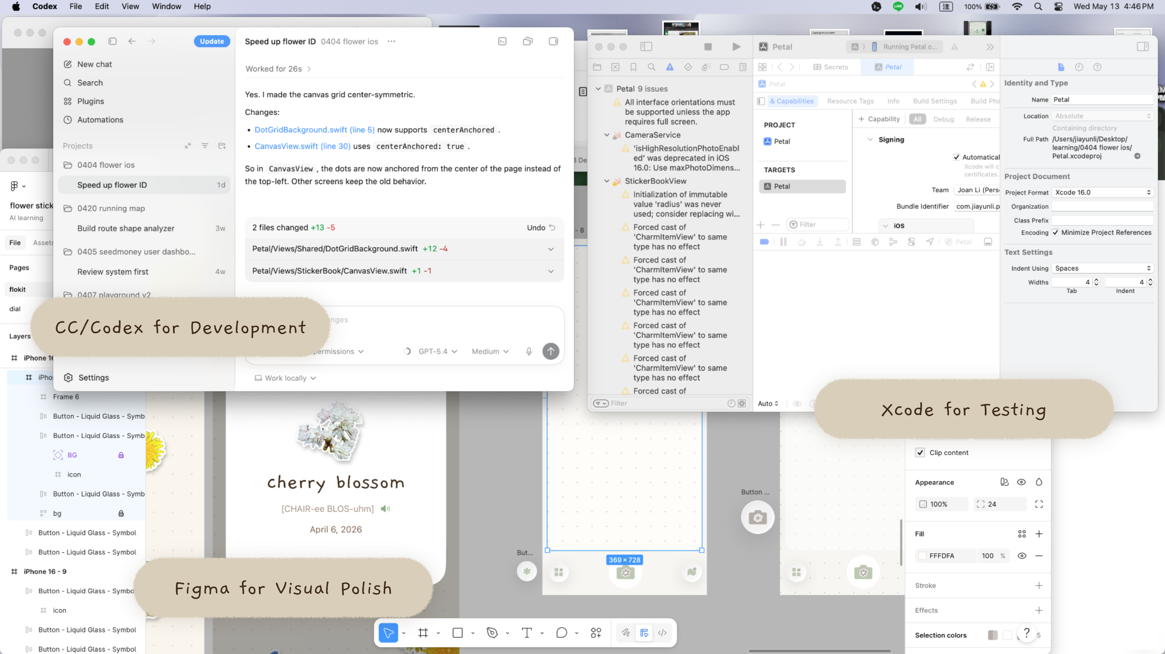
How I collaborated with AI
I used Claude Code and Codex across the whole process. The important part was not just efficiency but the ability to make real product decisions inside a working app.
Scope and PRD
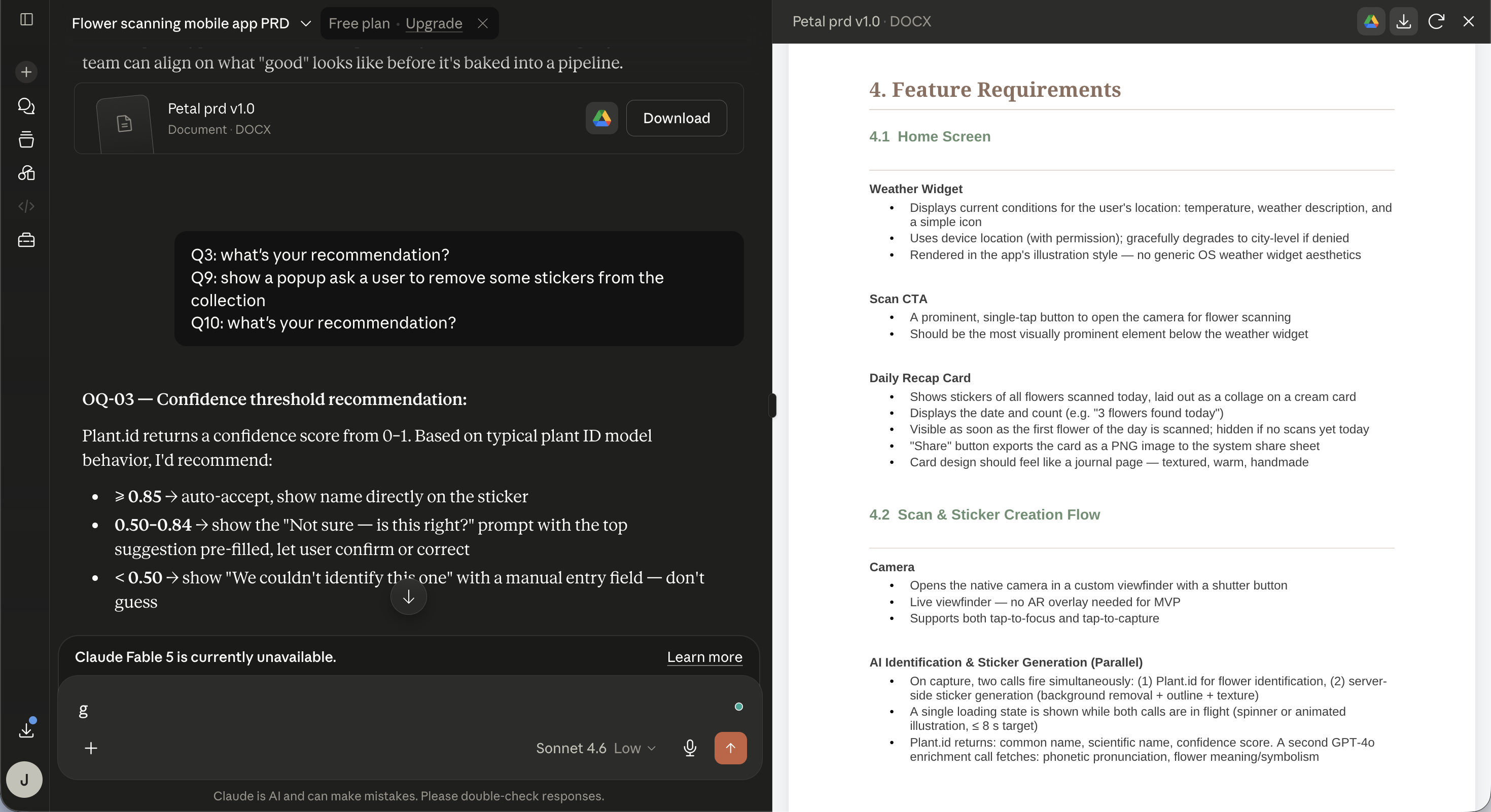
I used Claude to clarify the PRD. We defined the product scope, tech stacks, and key user flows.
Fast iteration
I started by feeding the PRD to Claude Code and then I got the first functional prototype without any wireframe. It looked rough, but it worked. I was able to iterate based on the prototype efficiently.
I used both Claude Code and Codex, combining with Xcode, to iterate the prototype. Instead of spending most of my time creating static mockups, I was making decisions directly inside a working product.
The iteration focused on streamline the key user flow and making the screen easy to follow.
Design polish
I still used Figma sometimes, mainly for refining visuals like colors and textures. Figma’s canvas allow me to explore different iteration visually.
While I like to iterate faster without Figma, I still enjoy the time dragging and dropping elements in Figma to craft a screen.
Test in real life
This was the first time I used an app I had designed while walking around to test in real life, and it worked! That gave me confidence and product signal that static screens could not.
What I refined
Once the direction felt right, the work became about how the product actually felt to use. While AI helped me move faster, I still maintained the design ownership. I made product decision about what quality meant and what tradeoffs made the product better.
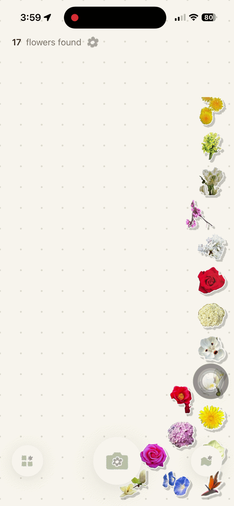
The sticker book worked. But was it engaging?
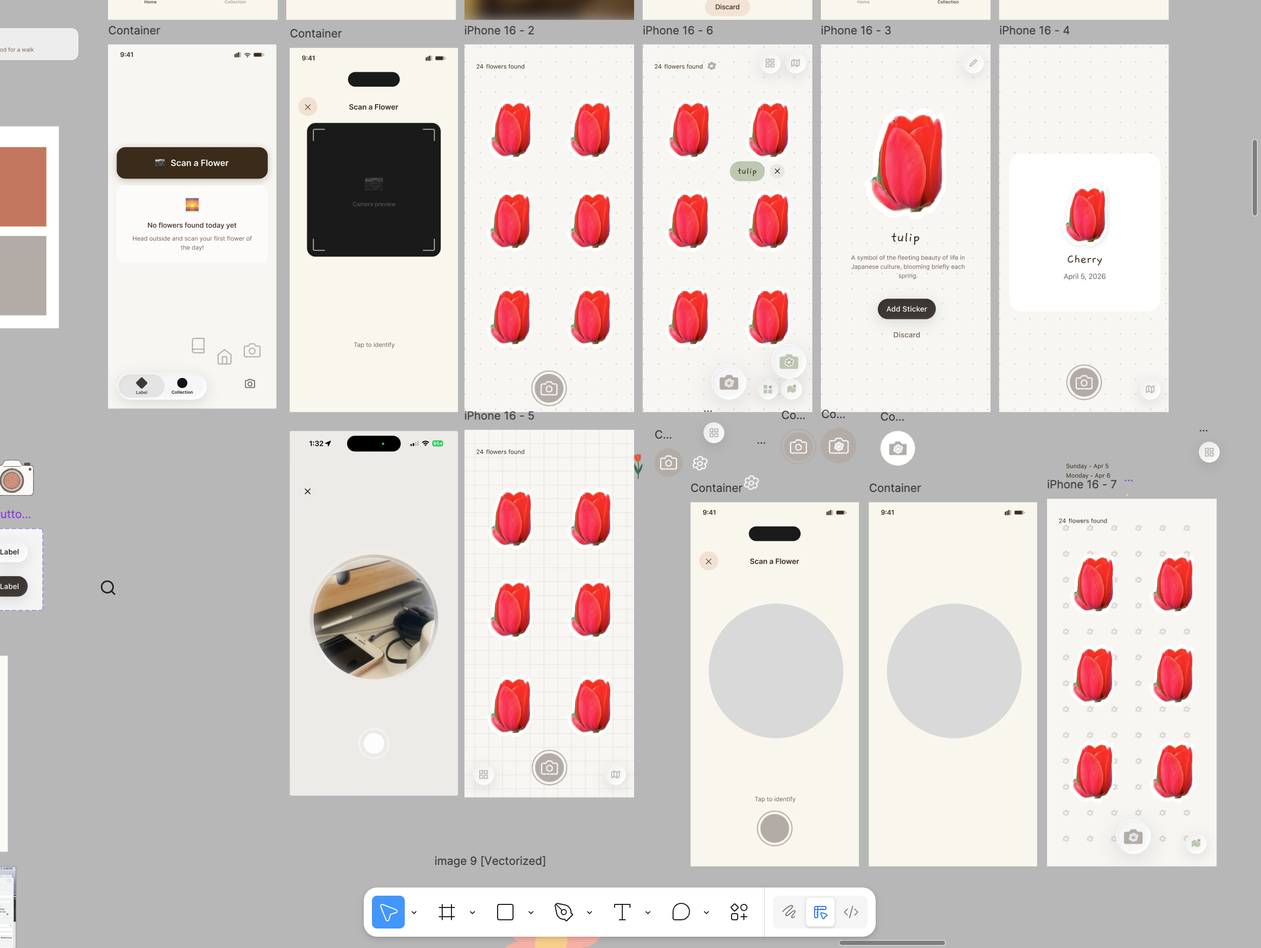
Originally, the collection was a static grid of stickers. It worked, but it did not feel rewarding, and it was hard to see all the stickers at once.
With AI, I could test multiple directions quickly, including vertical scroll, horizontal scroll, and swipe cards.
What if collecting felt playful, not just functional?
The purpose is to make the app engaging, so I explored a new direction where flowers became moving stickers inside an interactive canvas instead of static items in a grid.
I do not think I could have verified and experienced this idea without AI. AI implemented the concept quickly so I can decide whether it was worth pursuing.
Sticker boundaries
Once I decided the direction, I started to polish the details. The first implementation had stickers overlapping with the CTA buttons which decrease their discoverability.
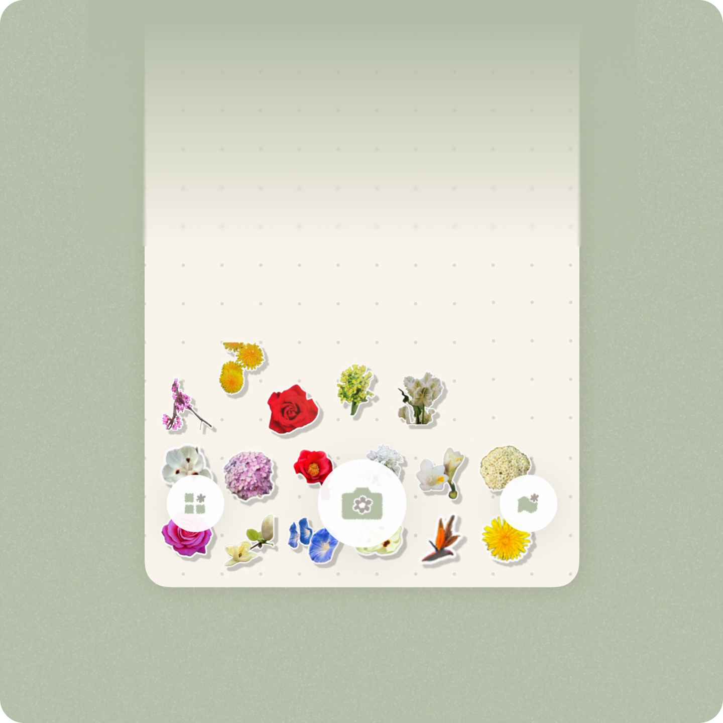
Grid symmetry
I iterated the canvas so stickers had a clear boundary to flow inside and the CTA stayed discoverable. I then noticed the generated dot grid looked uneven because it rendered from the top left corner. I asked Codex to rebuild it from the center so the structure looked more balanced.
CTA discoverability
Finally, I darken the background color again to increase the discoverability of the CTA buttons.
Transitions
There was an extra screen and some flashes when adding a sticker. I removed the unnecessary pause so the collection flow felt smoother.
Performance
I noticed the loading was slow. By working with Codex, I found unnecessary backend work and paused it so the main user flows became faster and smoother.
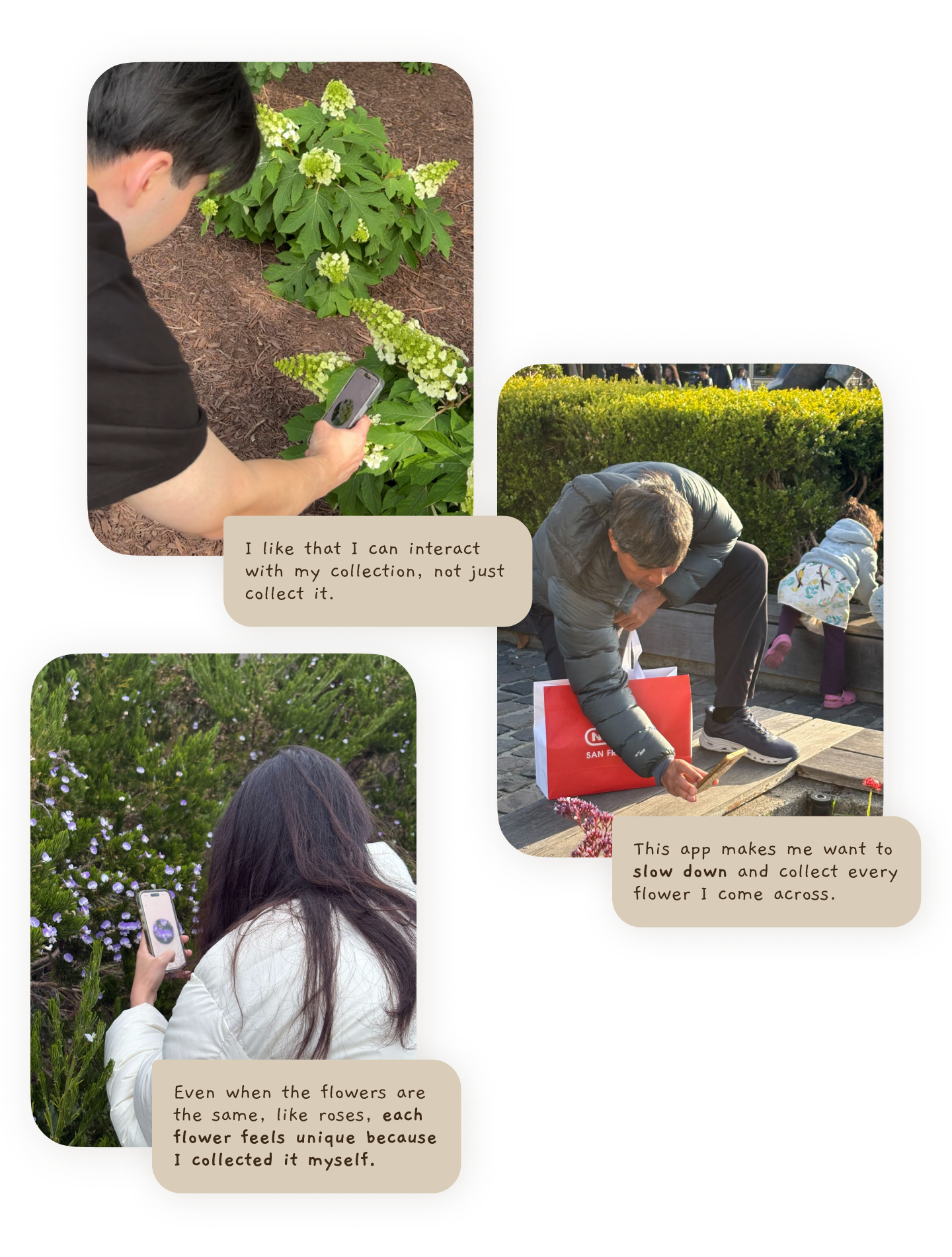
User testings validated the concept
I enrolled in the Apple Developer Program so I could send the app to testers with iPhone. I also lent my own phone to Android users who were interested in flowers.
One participant only collected one sticker during testing, but was happy just moving it around by tilting the phone. Two other participants collected multiple stickers over three days. That longer testing window let me observe how people used the app in their real lives. I am excited to learn how users keep using the app in their lives and express their interest in the App.
The sessions also suggested how the product could grow, including rarity based sticker borders and social features for sharing collections.
Overall, testing the MVP gave me confidence that the concept was worth launching.
Launch preparation
I made some product decisions before launch.
Onboarding
I removed the login process to make onboarding as easy as possible. My goal was to get real usage and learn from it, not to add friction too early.
I also added the welcome, introduction pages, as well as a sample scan for the onboarding process. I wanted to deliver the app’s values, feels, and experience to users.

Monetization
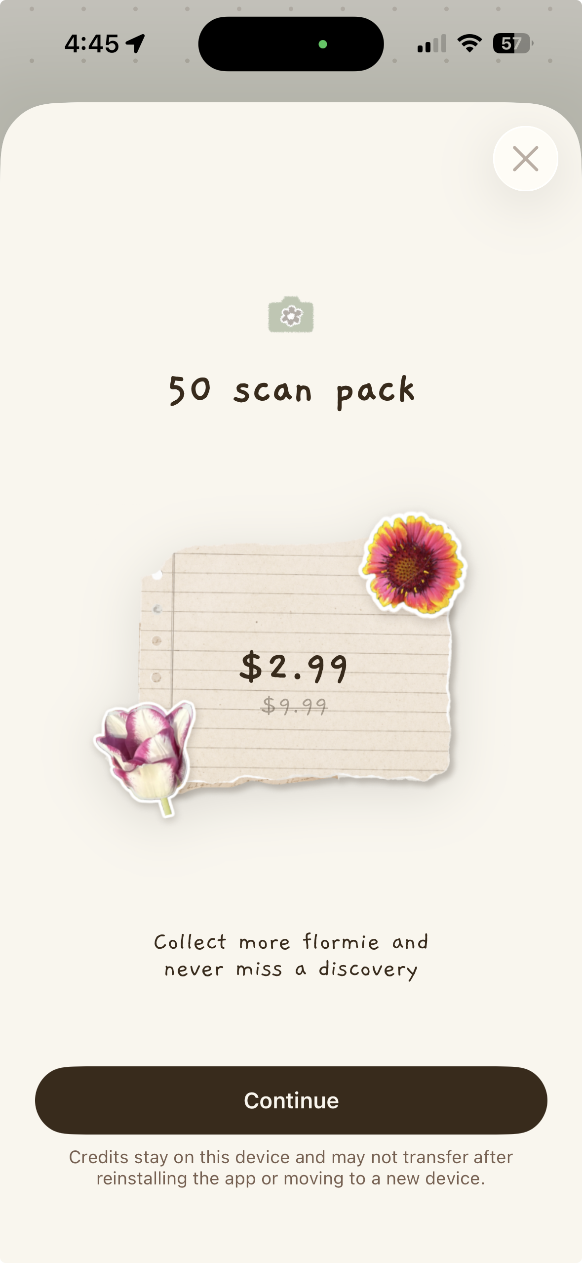
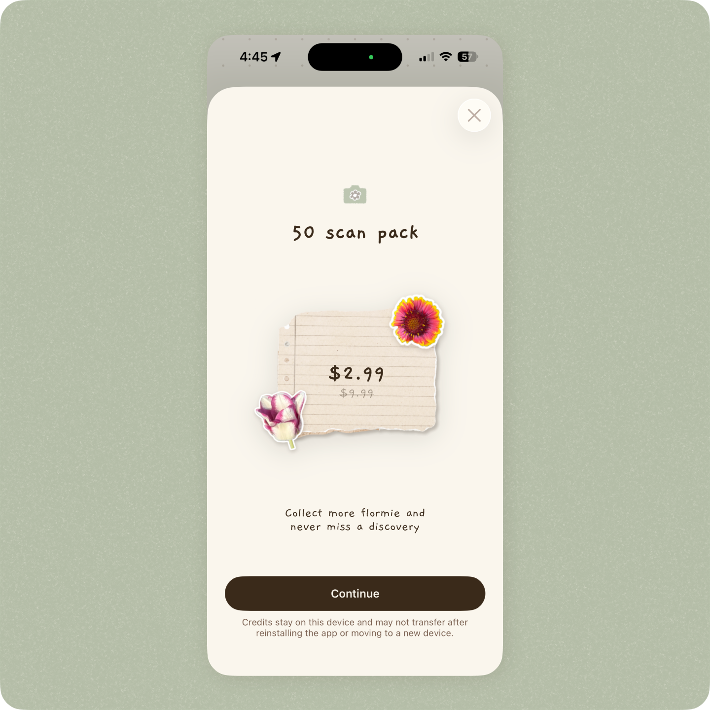
Because flormie relies on paid APIs for flower identification and content generation, I needed a sustainable way to cover usage costs.
I implemented an in-app purchase (IAP) model that gives users 20 free scans to explore the experience before paying. Once those scans are used, users can purchase an additional 50 scans for $2.99.
I intentionally kept the price low to reduce friction and encourage casual exploration while supporting ongoing API costs.
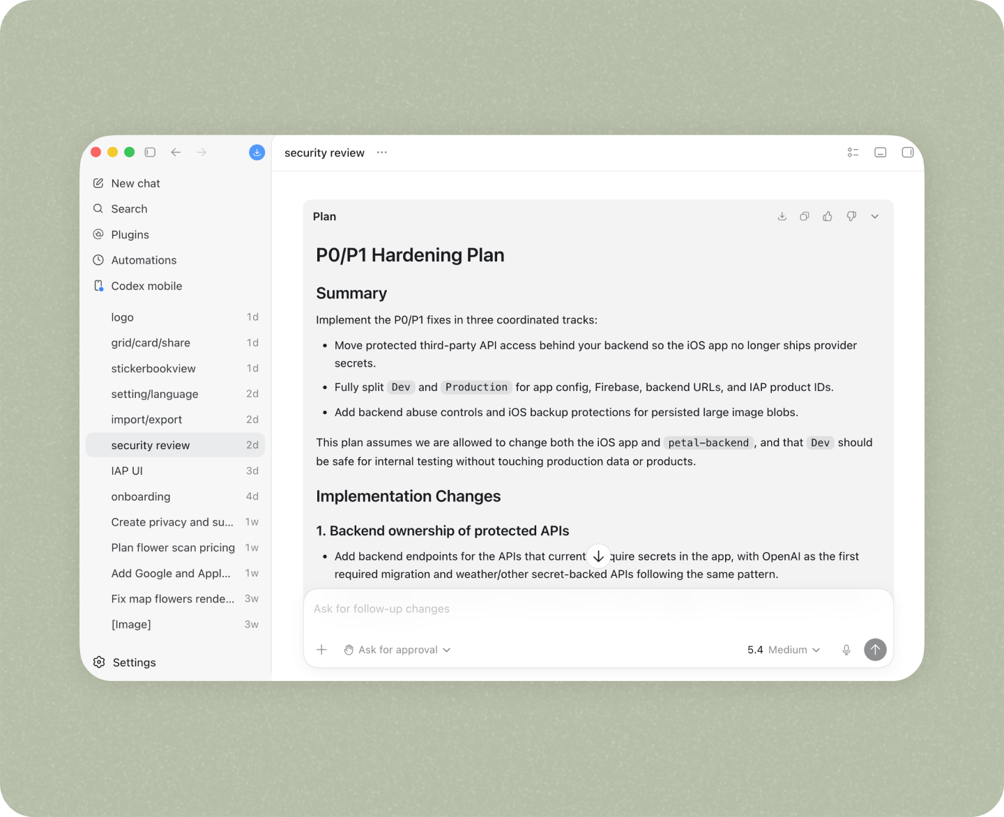
Security
To prepare for launch, I reviewed security best practices shared by independent developers and spent two days strengthening the app's backend.
I deployed the backend on Vercel, implemented rate limiting, and added request validation and guardrails to protect API endpoints.
Throughout the process, I used Codex as a technical partner to identify vulnerabilities and work through fixes step by step.
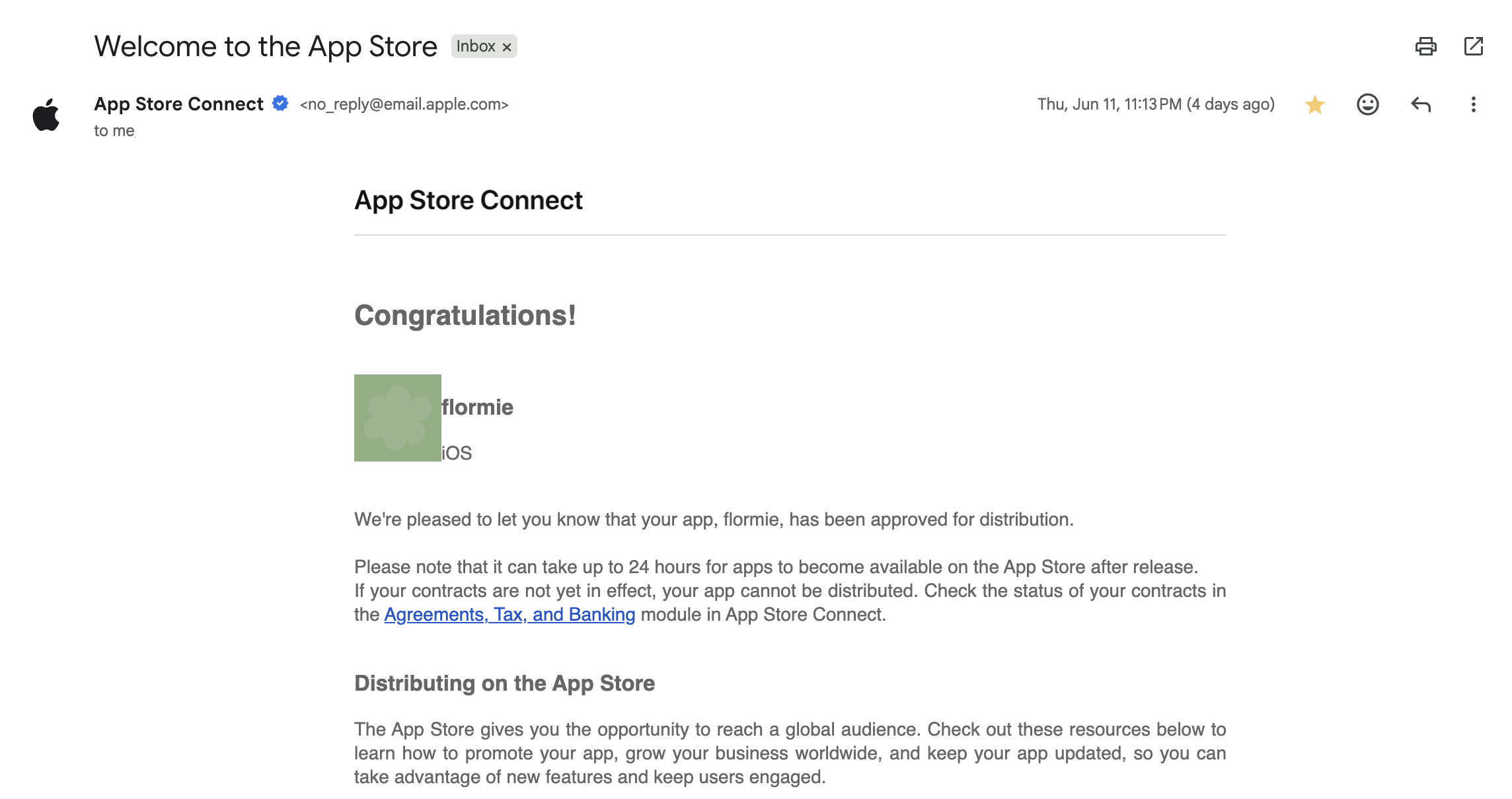
Launch
I went through the review process, waited for a few day, and flormie is now on App Store!
The App is not yet perfect and I have a to-do list in my pocket. But being able to launch my App is a big achievement for me as a designer (now product builder!)
I will keep updating and iterating once I collected more data from users.

From Designer to Builder
By collaborating with AI, I explored a faster and more iterative design process beyond static screens. For example, I couldn't have evaluated the motion and gravity-based interactions of the canvas in Figma alone. Building a functional app also allowed users to live with the product on their own devices for several days, something a prototype couldn't fully support.
I learned to move quickly while staying flexible and adaptable when designing with AI. AI often generated unexpected results, but embracing that ambiguity led to new opportunities. For example, I didn't plan for the bouncy motion in the interactive canvas, but when Codex implemented it, I realized it made the experience more playful and delightful. That kind of discovery became part of the process.
Most importantly, I can now confidently call myself a product builder. Building flormie required thinking beyond screens and UI. I had to consider performance, security, onboarding, monetization, distribution, and marketing. This project pushed me to expand my skill set and take ownership of the entire product experience from idea to launch.
This is my first app, and I'm excited to continue improving it and building more products in the future!
(And yes, I'm incredibly excited to see people using flormie in real life. If you try it, I'd love to hear your feedback! Download now)